Before & After – Polyonics Branding
Polyonics is a global company. Their branding had served them well in the past, but it needed a refresh to support their messaging and capture the level of product innovation, quality and personal, collaborative service that they offer to their customers. Further, their marketing collateral lacked consistent brand style and strategy. Together, we and built a versatile system for promoting all of their products with applying the new brand style to technical data sheets, product brochures, print and digital advertisements, tradeshow graphics, and other various brand touch points. We brought the supporting imagery up to the next level by using stock photos to show product applications, and in many cases working a little magic on their existing photos to make them match the new photography style.
The Logo:
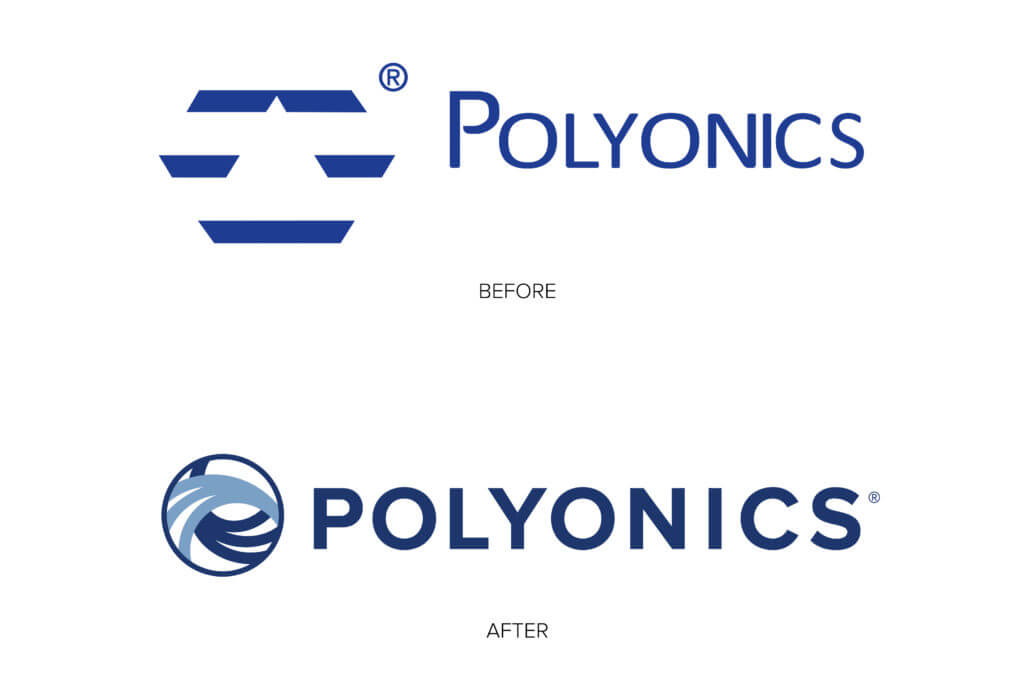
The goal with the new logo was to visually show the company’s values and strengths, as well as the products they make (primarily label substrates for harsh environments like jet engines, computer chips, cryogenic storage and other extreme temperature and chemical-exposure applications). The design we came to is clean, bold typography paired with a logomark that represents their collaborative process of working closely with their customers – a handshake, ideas flowing, working together. It also represents the physical products that they make – solutions mixing together, two layers of material being combined together, a substrate being coated.
The Collateral:
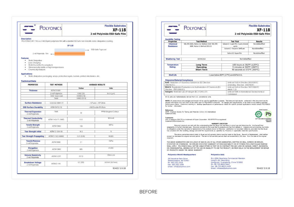
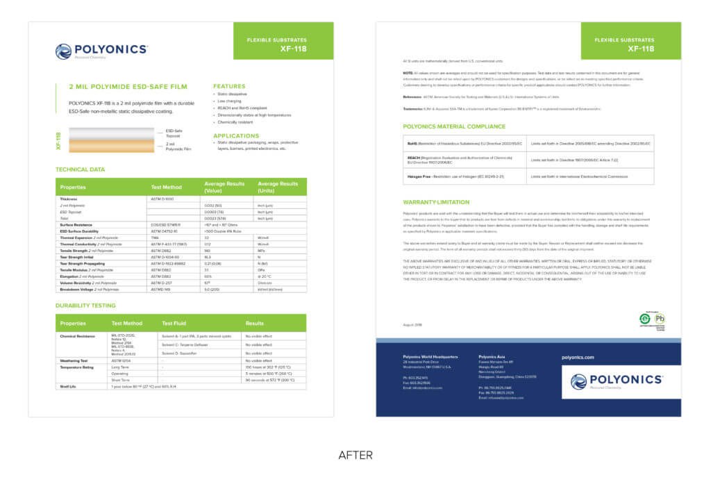
The collateral was all built by the internal sales and marketing support team. There were no brand standards in place, which means the fonts were mostly defaults, the layouts were inconsistent, and the look wasn’t as professional as it needed to be.
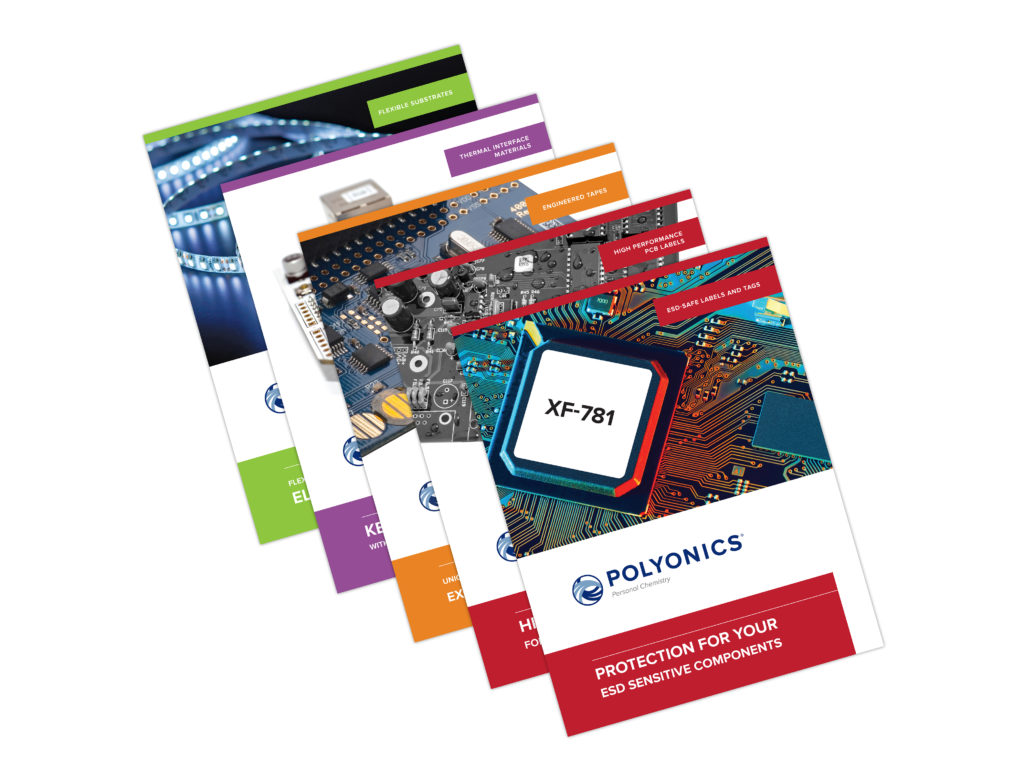
I applied the brand identity, cleaned up the look, and made all of their product brochures, informational product sheets, and technical data sheets easy to read, while still in a template designed to be easy to make new collateral for future products. Each of their 4 product categories was assigned a color, so all of the collateral is color coded to make the it easily distinguishable among a group.
Ads:
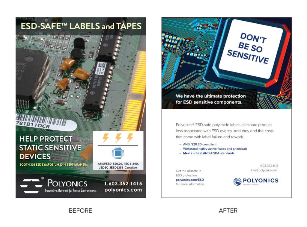
I re-designed their print and banner advertisements with more dynamic graphics and cleaner typography giving a clear hierarchy to the information. The result is a more inviting ad that is much easier to read.
Trade Show Graphics:
I re-designed their banner stands and trade show booth backdrop to more clearly communicate at a glance who they are and what they make, leaving trade show attendees informed rather than confused.
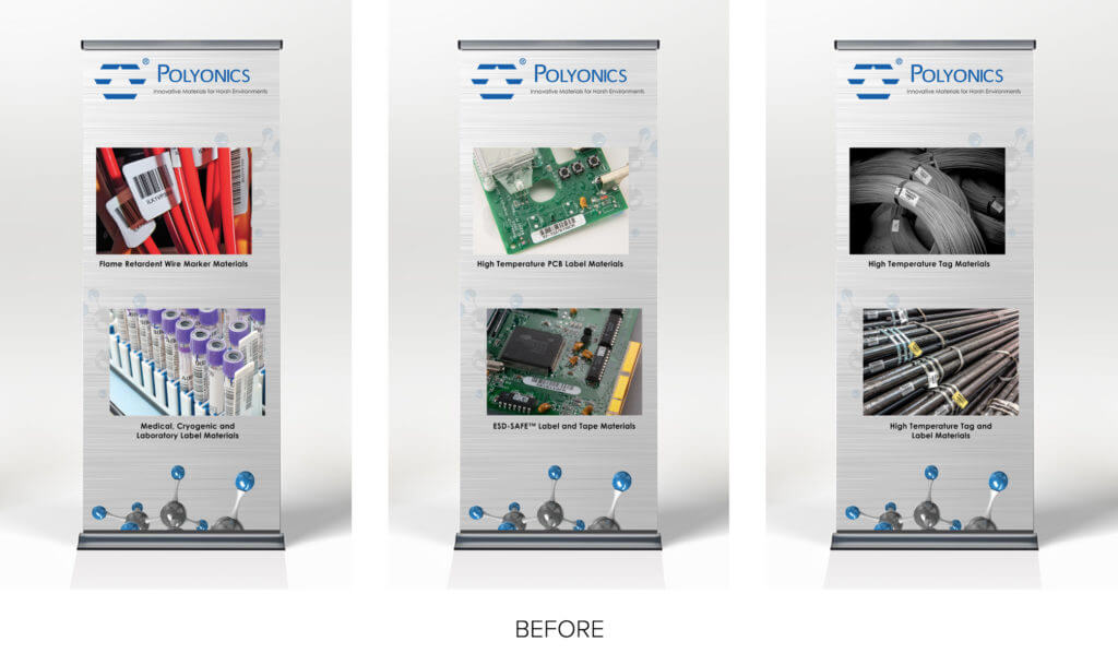
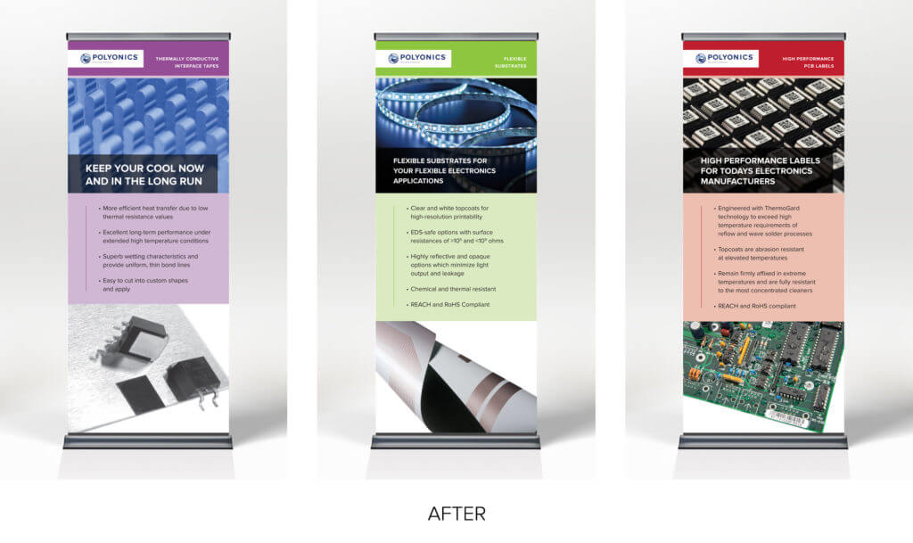
As you can see, the brand was completely transformed and brought up to the high standards of products and service that they deliver.
What do you think of the re-brand? Let me know in the comment section below!
Sorry, the comment form is closed at this time.

Kathryn Rogers
It looks like an entirely different company! What a transformation!
Jenny
Thank you! It’s amazing what up-leveled branding can do!