

Janegee Branding
Client: janegee
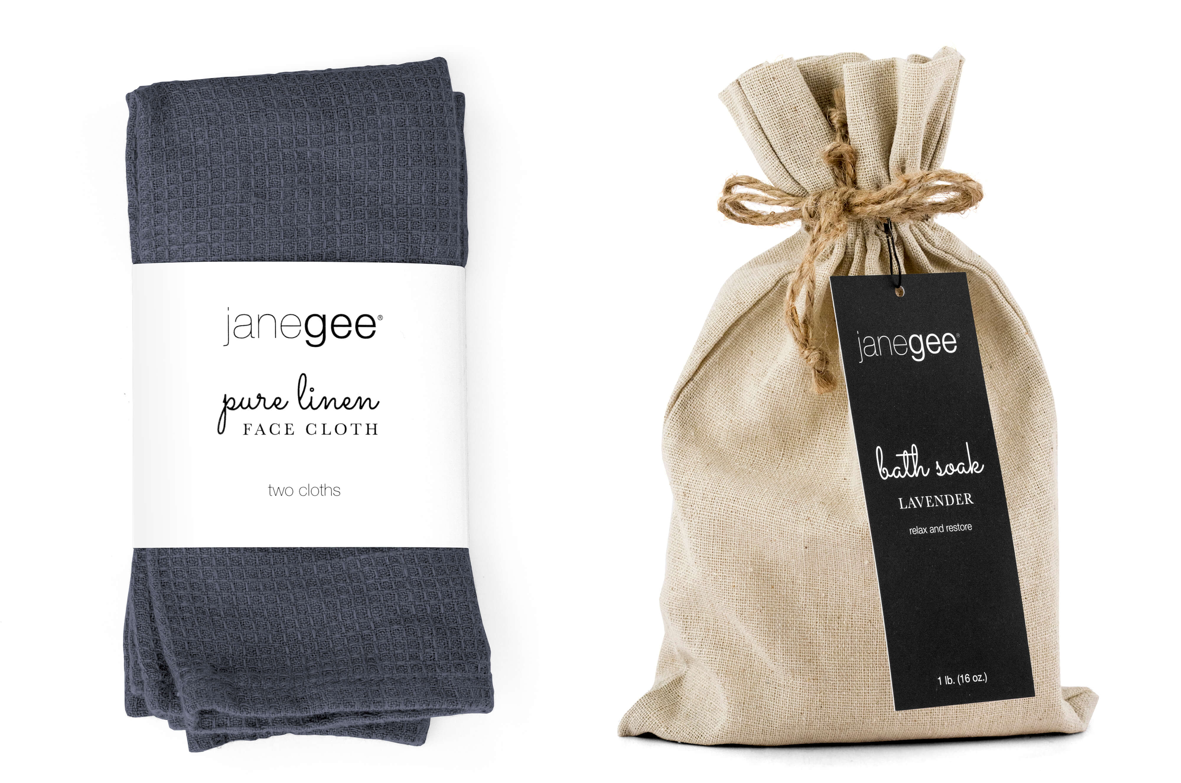
Janegee is a natural beauty product maker and retailer with both online and brick-and-mortal stores. They came to me in need of a brand refresh. They had a logo they loved, but their packaging was neither consistent nor indicative of their high quality products.
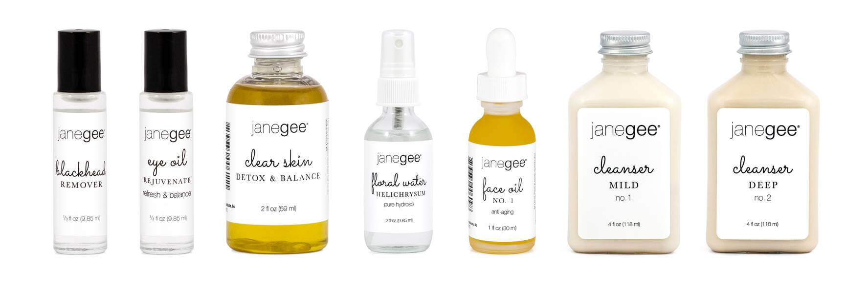
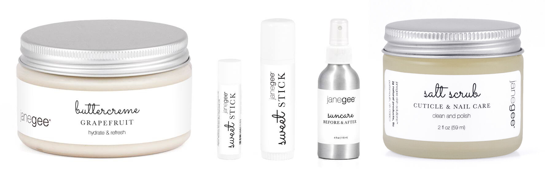
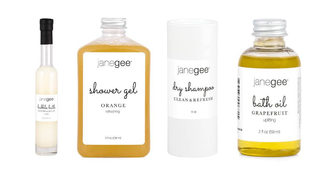
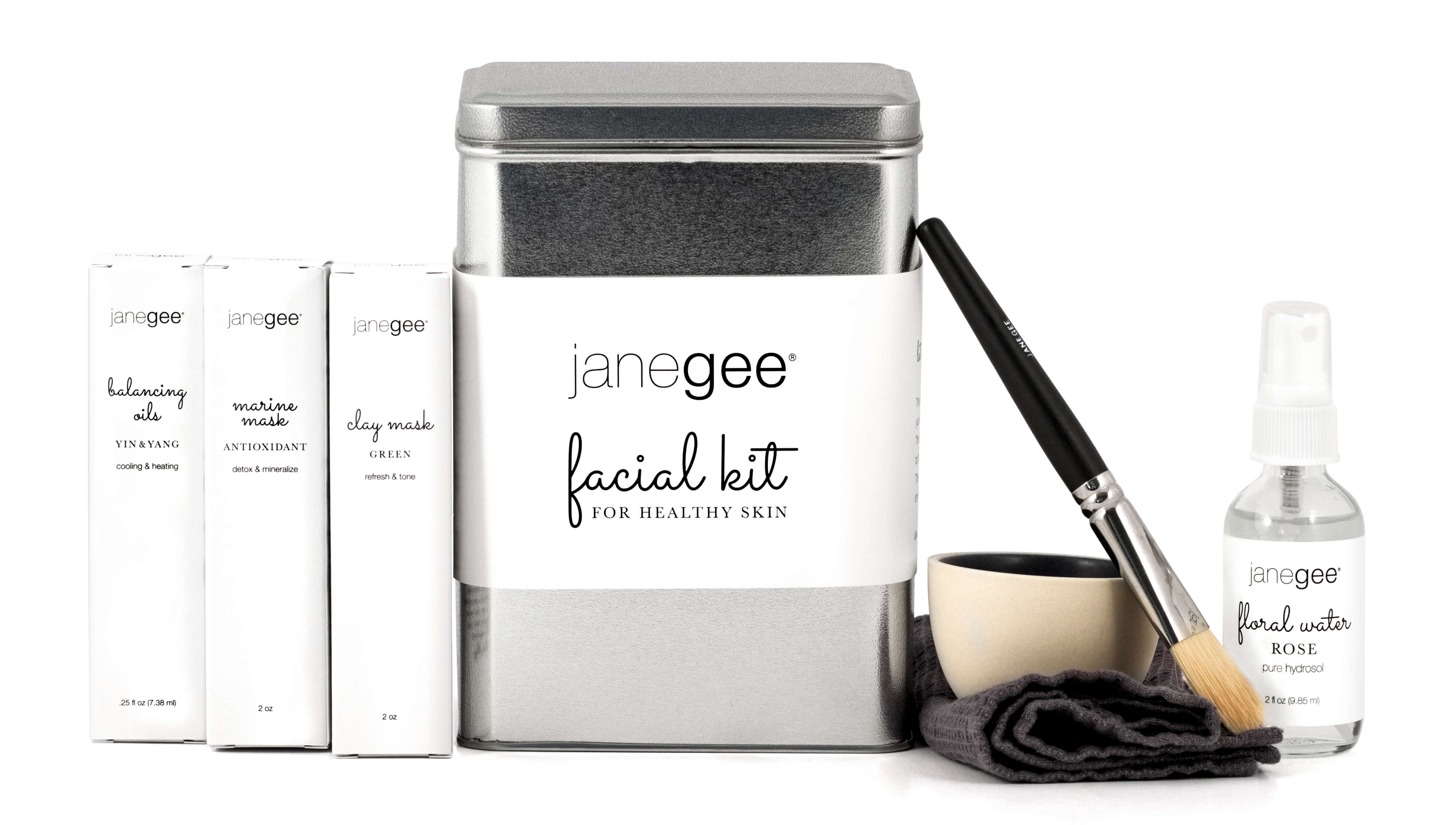
The solution came to be a simple, typography-based design that harmonizes the three feelings they were going for: clean, luxury and feminine. The janegee logo is set in Helvetica Neue, so that would serve as “clean”. I combined it with Baskerville for “luxury”, and Sacramento (customized) for “feminine”. There strict usage rules were set for each of these typefaces in order to maintain the correct balance of those feelings.
Production of packaging was also factored in to the brand look. The simple black and white design would be very easy for color management as they print their own labels in-house as needed. It’s also economical for any packaging that would need to be printed or manufactured by a vendor. The typographic design can be easily translated to different size and shape labels to fit any new product package and expanded upon when necessary for special uses.
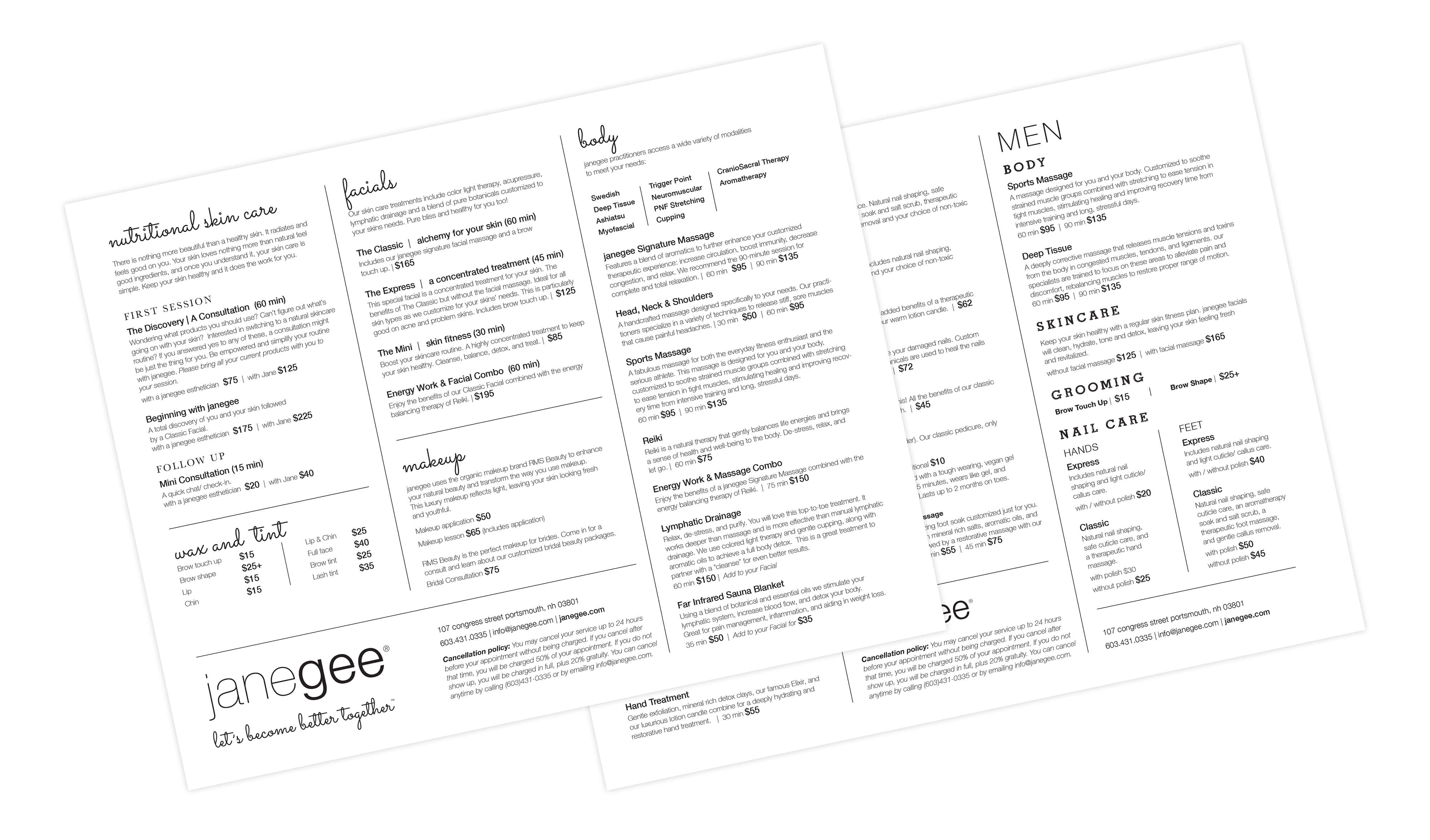
The new look was then applied to labels and packaging for over 100 products, all in-store signage, web and social media graphics, brochures, boxes, hang tags, service menus and product description collateral. The branding has been in use since 2016 and continues to serve their company successfully.
*Winner of an American Graphic Design Award in the Packaging category from Graphic Design USA Magazine in 2016